
What's Happening - August 2026
SCUM-ing soon.
Welcome to my monthly newsletter, giving you updates on the things I’ve been lettering, reading and writing this month.
What am I writing?
If you follow me on any social media, you'll know I've entered into the "being annoying about it on social media" phase of my upcoming Kickstarter. SCUM #1 is coming to Kickstarter next month, and I cannot wait for all of you to get to read it.
First off, we have what will be the Collector's Edition cover by Icezimy:
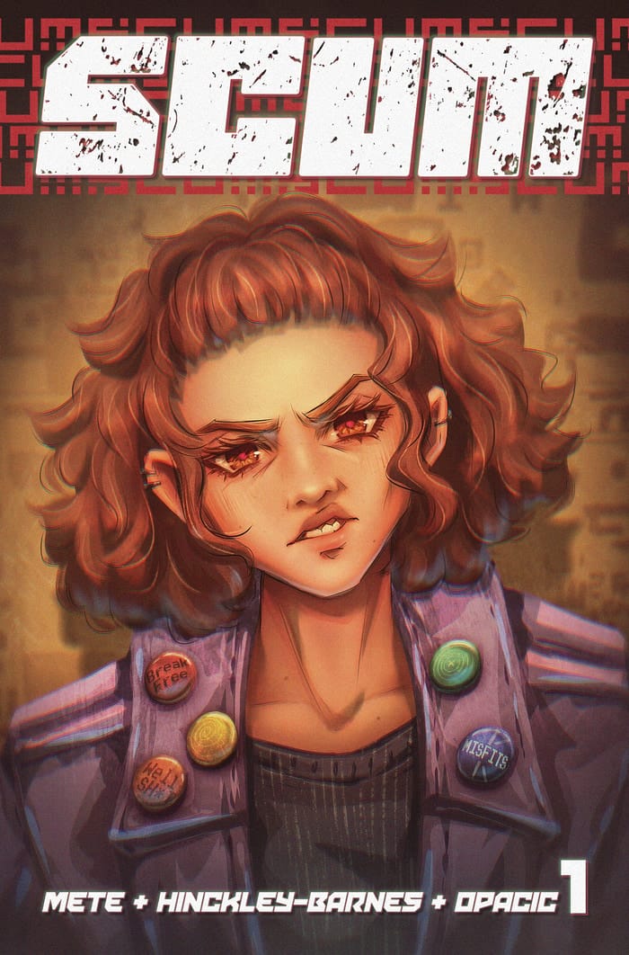
I'm trying something a little different for SCUM than what I've done with previous Kickstarters. Instead of having multiple covers, there are just going to be two, a standard cover and the "collectors edition" cover. Above is the collectors edition, which is going to be printed with a spot UV treatment and embossing on the logo elements. It's gonna look great.
Based on how variant covers have sold for my previous books, I don't think variants are a big draw for folks who read my books. Understandably! I'm not a big variant person myself. But what I am, is a big special edition person. So, we're gonna try that out and see how it works. Will it? Who knows! Kickstarter is an enigma.
But more importantly than any of that, I want to give you a sneak peak at the actual pages from this issue. I've shared some of these around on social media, but never all 13 of the ones I'm going to include here. So, for your reading pleasure, the first 13 pages of SCUM #1:
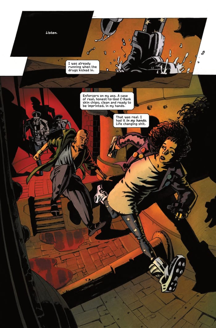
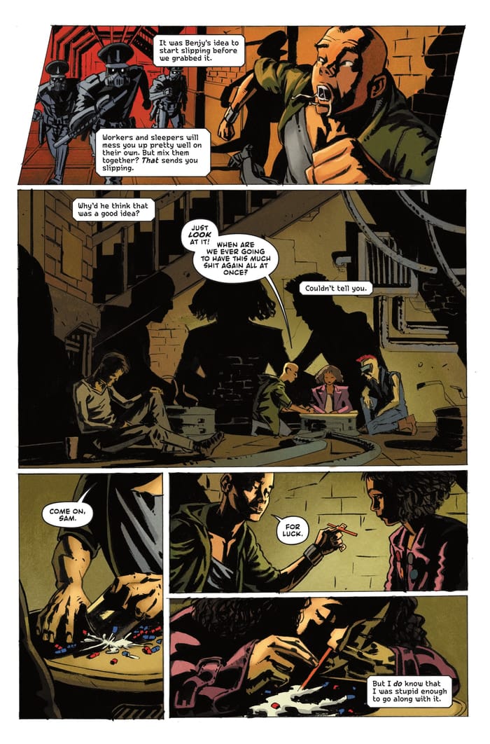
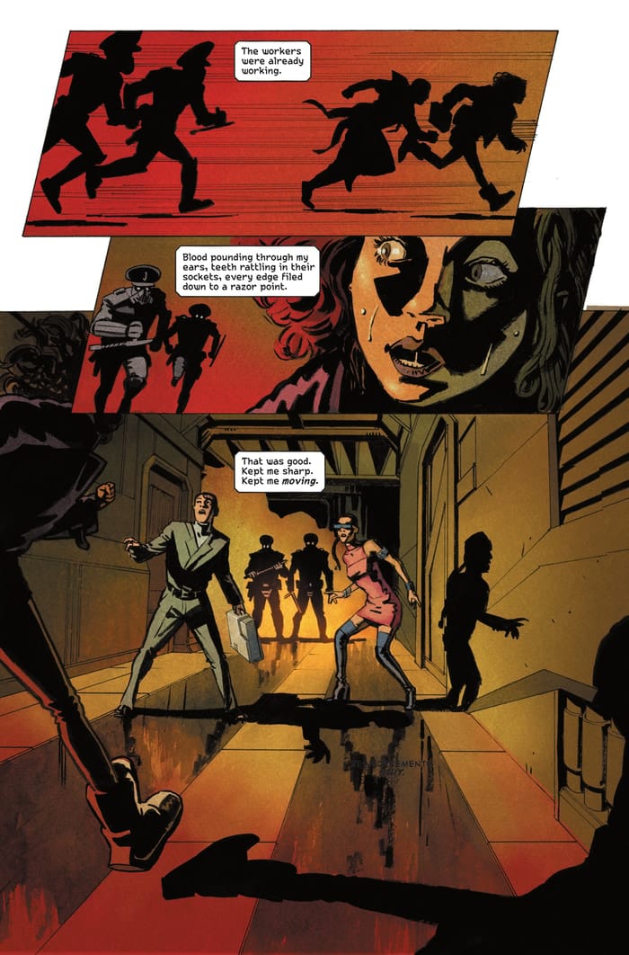
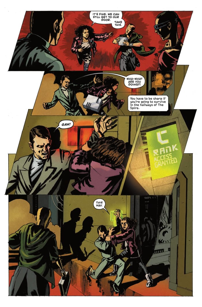
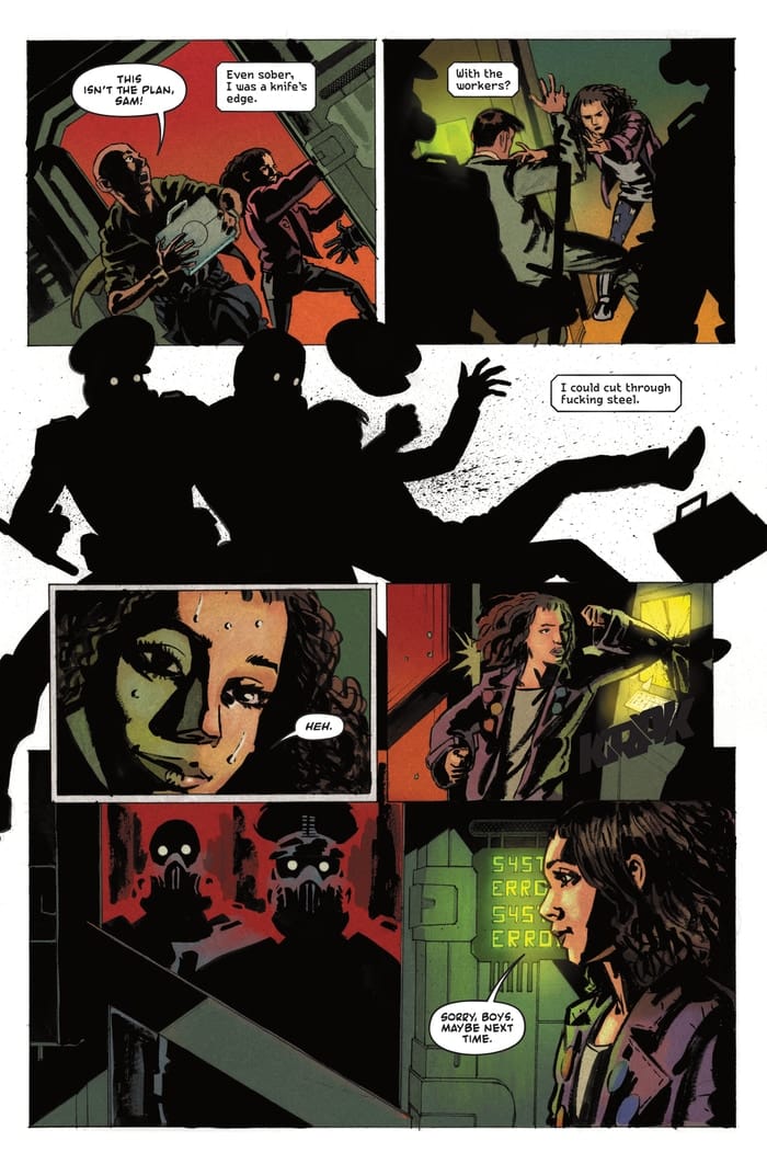
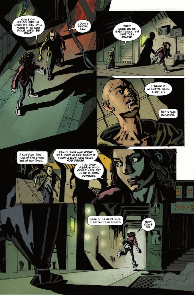
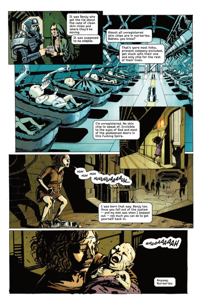
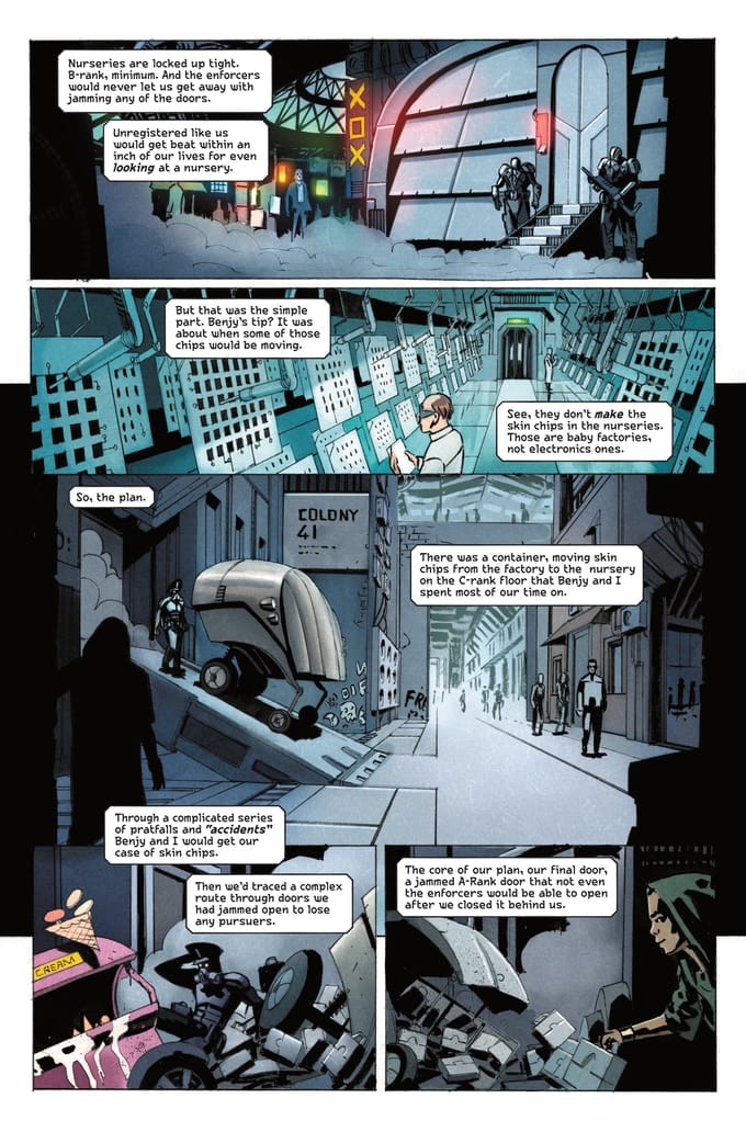
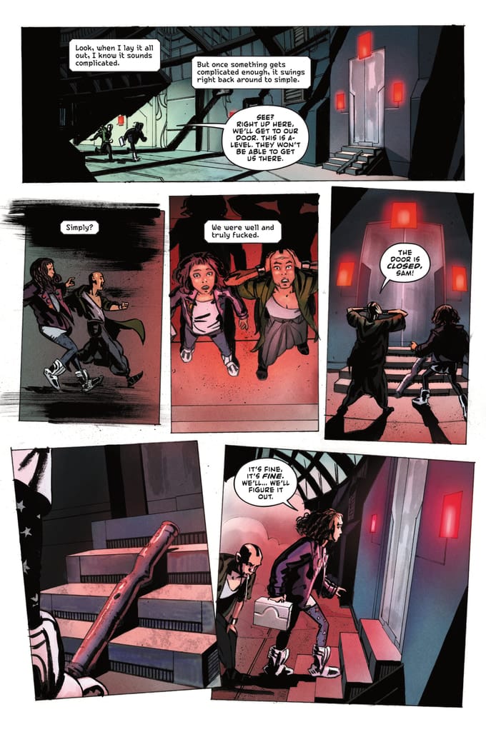
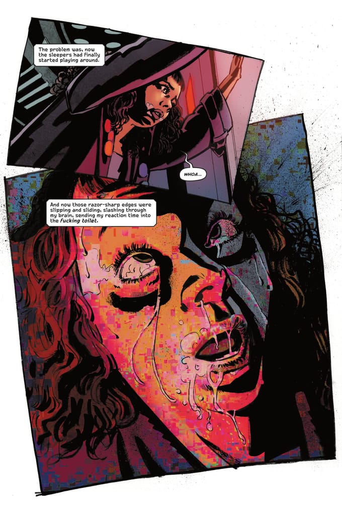
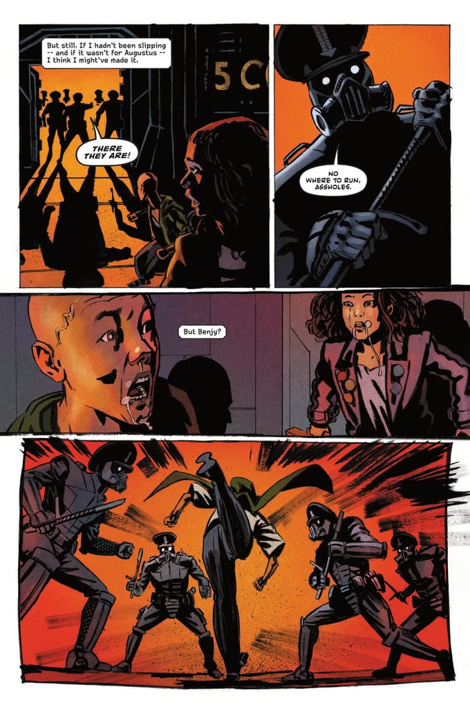
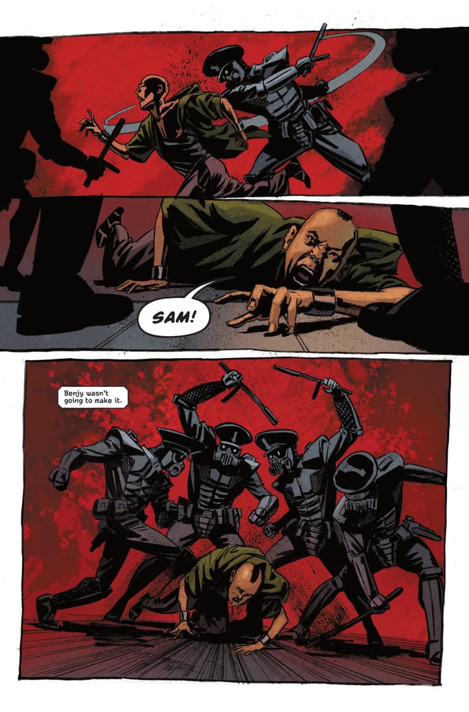
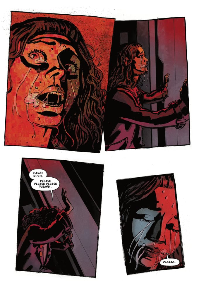
And one final time, please follow our prelaunch page!
What am I lettering?
Looking back at the last couple months of these newsletters, I realized I haven't included much in the way of actual talking about lettering, and there's nothing I like doing more than really getting into the weeds with some tiny lettering decision. So, here's something fun from a recent project:
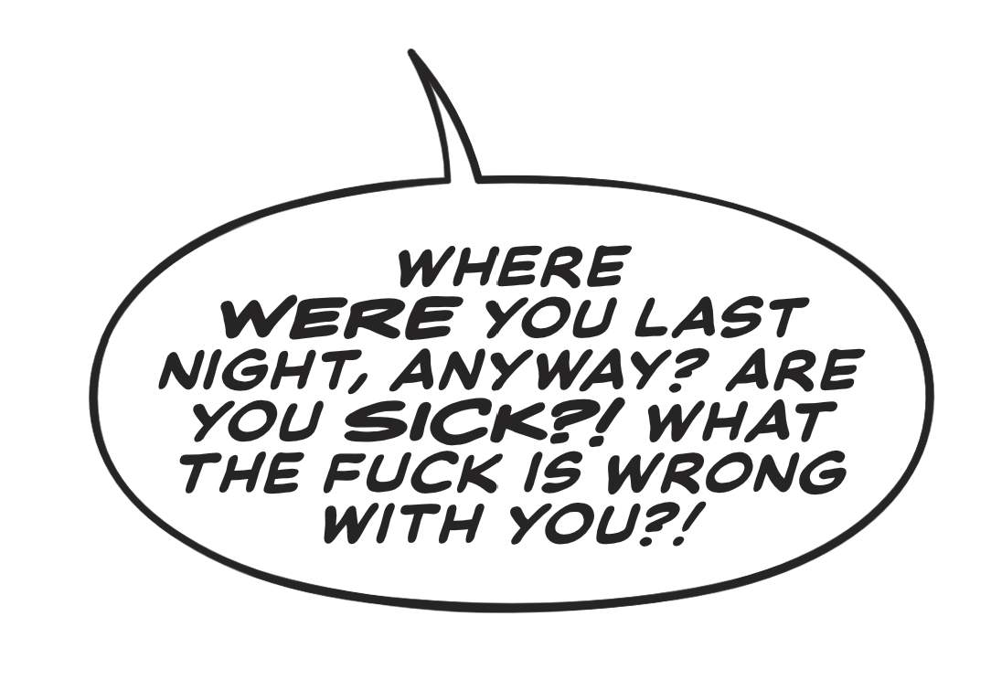
In the above balloon, there are two fonts. For the book this balloon is from (Devil in American #3) the main dialogue font I'm using is Blambot's Nerves of Steel, one of my favorite dialogue fonts. You might recognize it from the dialogue in Hero of Legend, where I also use it as the main dialogue font. Like I said, it's a font I really like!
Sometimes, though, certain comics call for extra levels of emphasis in the dialogue. Usually, dialogue comes in two flavors: standard or bold and italicized for emphasis. Anything more than that, and you're usually looking at a burst balloon, double outline balloon, or something that really communicates that a character is SHOUTING.
I've had a few books where the writers wanted a level of emphasis in between basic bold and italics and shouting, and usually what I would do is create an extra bold version of the font by just adding a tiny stroke around the particular word and bumping it up a point size or two. But in the balloon above, I've instead swapped in Blambot's Big Whoop, a font built for shouting, but the wider characters and slightly but not overly variable character size also works really well slotted in as an extra step of emphasis for Nerves of Steel.
Nothing revolutionary, but a fun bit of lettering that I'm quite happy with that I'll probably try to sneak into other projects that use Nerves of Steel in the future.
Comics on Kickstarter
In Prelaunch
Anything else?
Nope! Keeping it short this month. See ya!