What's Happening - May 2025
The Reed 'em and Weep monthly newsletter, now available in hardcover!

Welcome to my monthly newsletter, giving you updates on the things I’ve been lettering, reading and writing this month.
What am I writing?
Hero of Legend #4 is going live on Kickstarter in 2 weeks! Don't think I've had the chance to show it off yet, but here Niccolò's main cover for this issue:
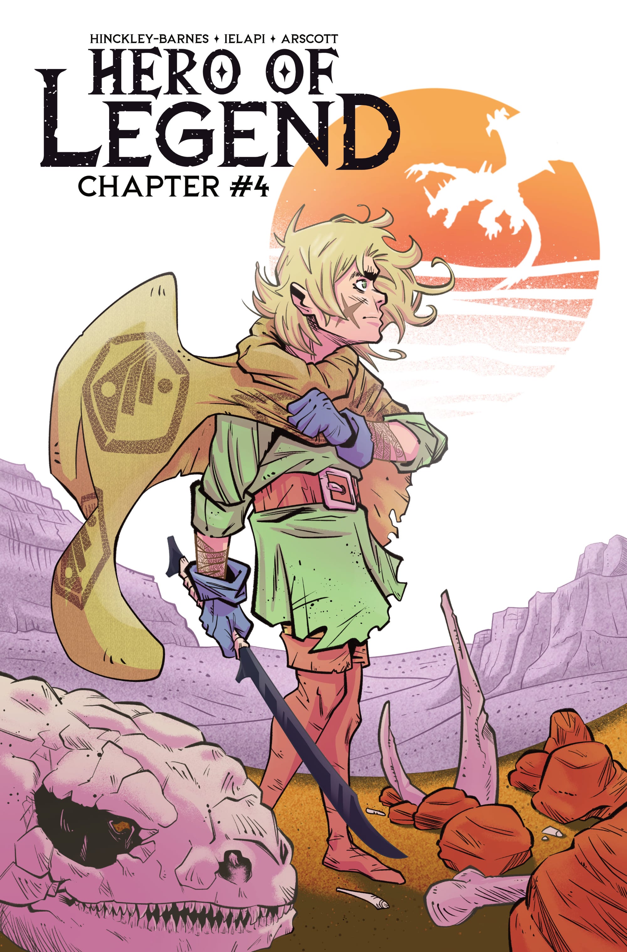
Maybe my favorite cover Niccolò has done for this series so far?! It rules, this issue rules, and if you're not signed up to be notified... why not?
On top of the exclusive discounts I'm giving to paid subscribers, we're going to be having a special promotion for everyone subscribed to this newsletter or who backed my previous campaigns. If you back our Kickstarter for Chapter 4 at a physical level and add a comment with your favorite fictional dragon, you'll get a free, exclusive Hero of Legend bookmark added to your order.
So, again, if you haven't yet, make sure you're signed up to be notified.
Aside from that, I've also been working on Chapter 5 of Hero of Legend. The writing has been a little slow going these past couple months. It's the end of the school year, which means a lot of my time is taken up by making sure everything that needs to get done at my day job before the school year ends is actually done.
But despite everything else that needs to get done, I've also been slowly putting the pieces together for another project. Maybe something that comes after Hero of Legend? Not a ton to show for it yet, but one of the ways I know an idea is worth doing is that I feel the urge to start putting together logo options for it. So, here's a little sneak peak of that:

What am I designing?
The link is down below, but I've been spending a lot of this month putting together the print files for the first hardcover collection of my comics work. One of the fun things about working as a letterer for other projects is getting the chance to build all these skills that I can then apply to my own books. We're now passed the half way point of Hero of Legend, and I've been doing a lot of thinking about what a collection for that series is going to look like.
It depends a lot on the economics of it and whether I'm able to make the money work, but I would love to make two versions of the volume for Hero of Legend. One a softcover, manga sized book, all black and white that folks can get for pretty cheap. Then a premium, hardcover edition printed at comic size and including all the color pages that have been in the issues and all the covers as well. Like I said, I'm still not sure I can make the numbers on that work, but I'm really hoping we can!
Some fun lettering
Armor of the Wicked
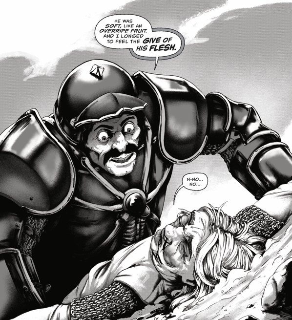
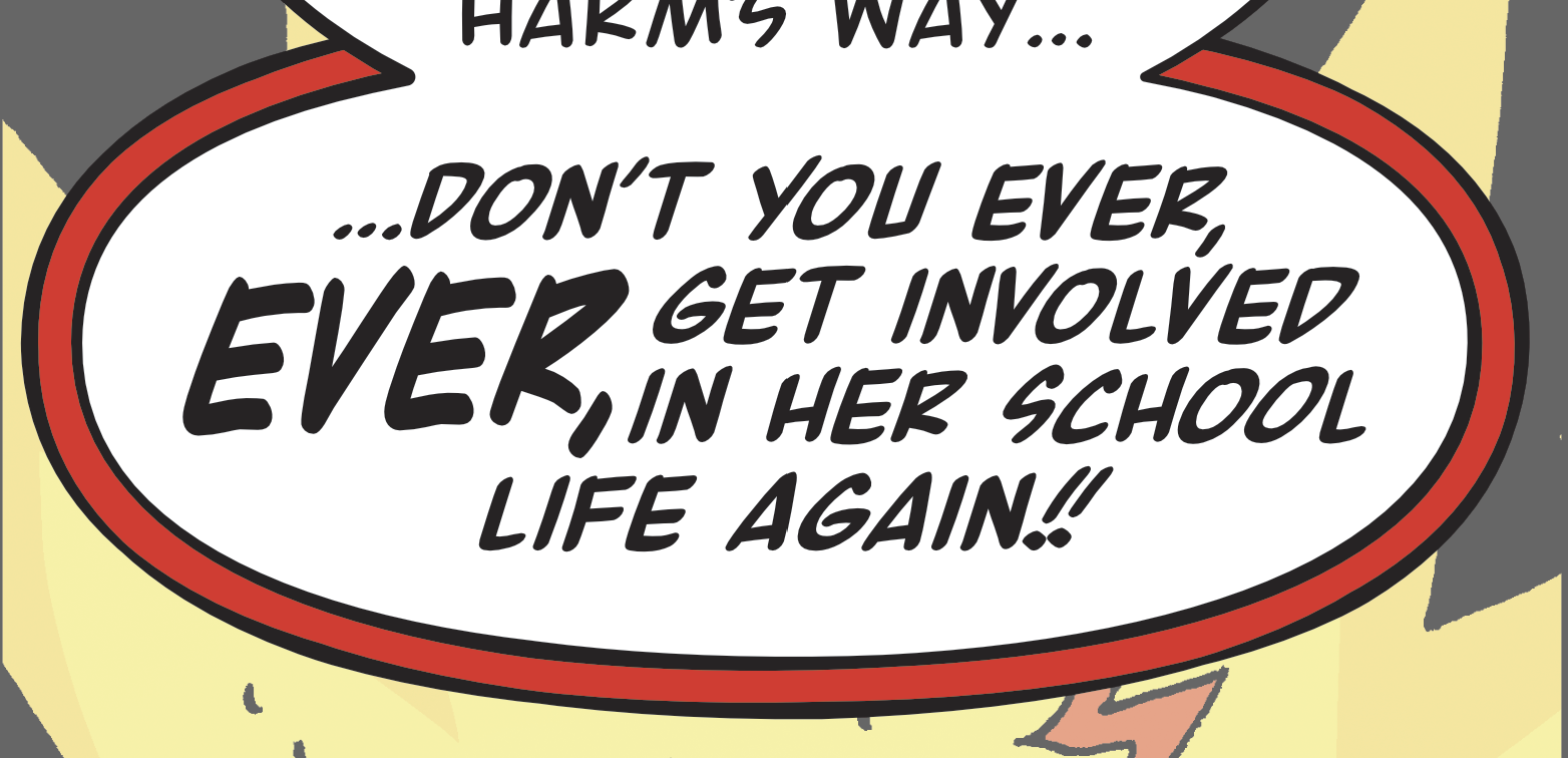
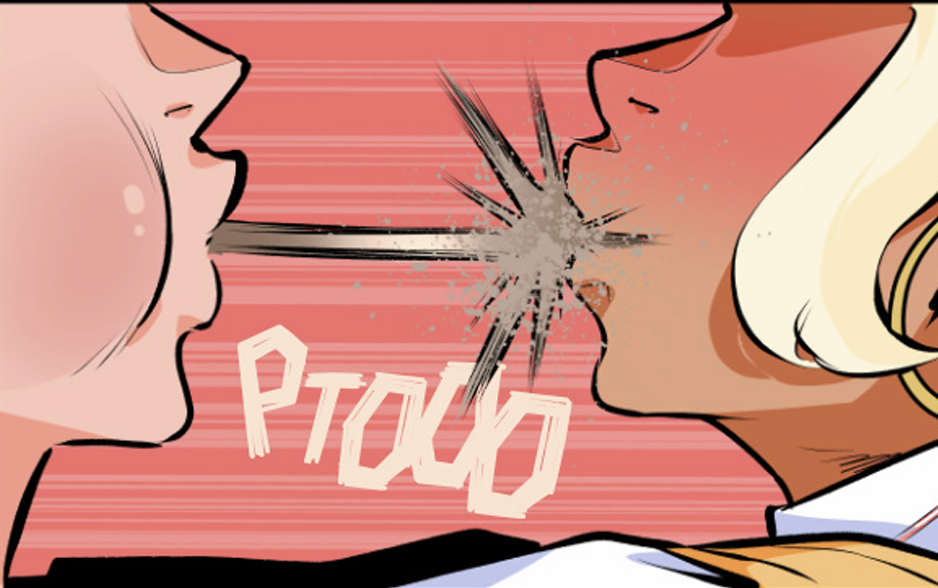
Dan Tappan, who I've collaborated with on a couple different projects, has been putting together some really fantastic medieval horror comics over on his newsletter that I have had the pleasure of lettering. Along with lettering from me and a script from Dan, this story, Armor of the Wicked and the previous one Danse Macabre both have art from Chris Pittas, who should be an absolute super star. Check both of them out and make sure you're following Dan for when the next story comes out.
I Summoned Cthulhu to Fund My Kickstarter: The Hardcover
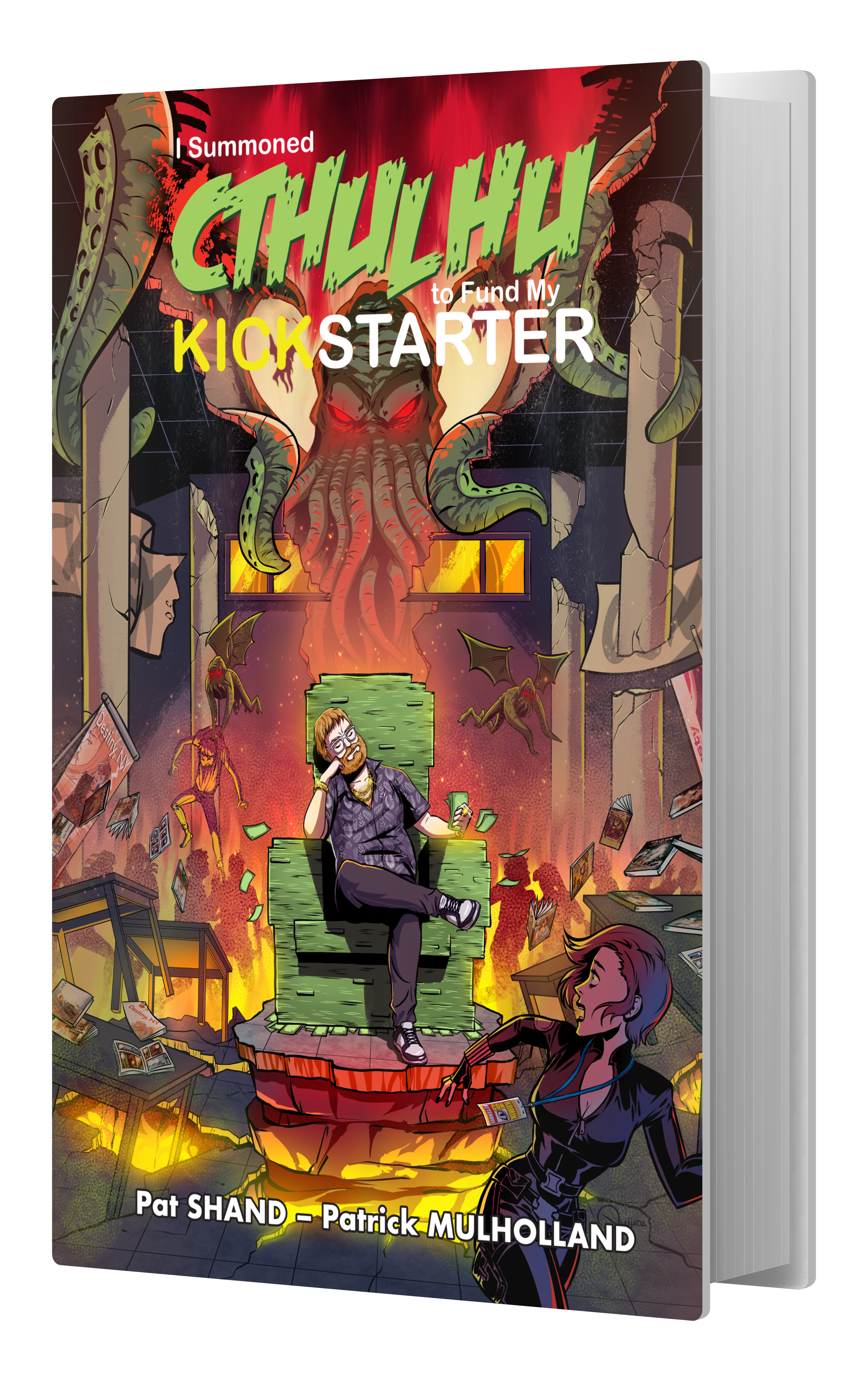
Currently live on Kickstarter, the first hardcover collection of a book with my lettering! This is the first book I worked on with Pat Shand and the crew at Space Between. It's a book that really hits. It's funny, but also deeply emotional, especially if you're someone trying to make your own comics.
I SUMMONED CTHULHU TO FUND MY KICKSTARTER, the epic horror/comedy about a writer who sells his soul to ancient gods in exchange for success, is being collected into a premium hardcover!
If you haven't read it previously, this is the perfect time to catch up with the series.
Some other prelaunch comics:
What am I reading?
The Fables of Erlking Wood
The Fables of Erlking Wood is graphic novel by Juni Ba and Aditya Bidikar. It was funded on Kickstarter toward the end of last year, and so far is the best book I've read this year.
This is one of the few Kickstarter's I backed as a physical comic and I'm glad I did, because even just as a physical object, the book is gorgeous. It's a hardcover book with painted edges, wonderful uncoated paper on the pages. The design on this book is perfect and I could die happy if I ever made a book that looked this good. It looks a feels better than maybe any other book I own, and I like to go for fancy editions.
And even if you're not a dork for nicely designed books, the stuff inside it is just as good. The book tells a story that moves across centuries, a series of fairytales and fables with overlapping casts. It's an immaculately structured book that still manages to feel like it is just a bunch of fairytales that happen to feature the same characters. I love a well crafted, clockwork story where all the pieces fit into place, but its even better when a story can be that well-crafted without you realizing that the gears are turning. Everything in this story is there for a reason, but you don't feel that as you're reading it. It's so, so hard to make something that feels this effortless.
I could write a few hundred more words about this book but, really, you should just go read it. Cannot recommend this book highly enough.
A Wizard of Earthsea: A Graphic Novel
As I was reading this book, I couldn't decide whether my issues with it were because of the book itself or because this is a novel I've actively spent time considering how I would adapt into a graphic novel. The answer, I think, is a mix of both. The issues and frustrations I have with this adaption are because I have another vision so cleanly etched in my mind. But, I don't think that means the issues themselves aren't real.
This adaption, of Ursula K. Le Guin's fantasy novel A Wizard of Earthsea is by Fred Fordham. Story wise, I think the book does a good job. There are a few, really important moments where the art is absolutely gorgeous. And the landscapes and locations are just stunning. But the characters in those landscapes feel stiff. I can't say for sure what Fordham's process is but they feel like posed 3d models. Nothing wrong with using those! But it does ruin the illusion when I can still feel them in the artwork. The art is also mimicking a watercolor and a paper texture that never feels like anything but an extremely digital recreation of those forms. It's a bummer, because I think for an adaption of A Wizard of Earthsea to succeed, the art needs to communicate everything that sits between the lines of the novel. It needs to be beautiful, but in order for it to be a worthwhile adaption, it needs to give you a look into these characters that doesn't exist in Le Guin's sparse but beautiful prose. The art has to be as beautiful as the sentences in the original novel and this book does not have that.
Last thing, just because it's something I've been thinking about with printing, is the paper this book is printed on. (I know, I'm sorry, this is an insane complaint, but after spending so much time talking about how good Erlking Woods is as a physical object, I can't help myself from saying it.) The book is printed on glossy paper, which just highlights how digital the artwork is. I think a textured, uncoated paper would have done wonders for this book. But, alas.
That's it?
Yep! Bye.
